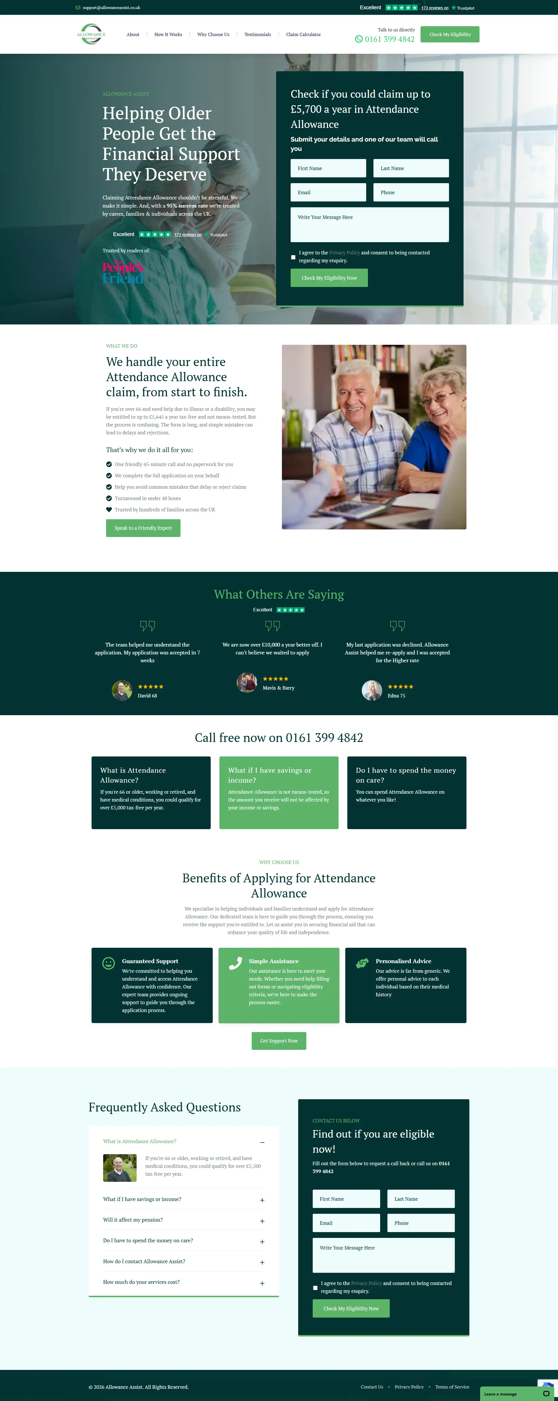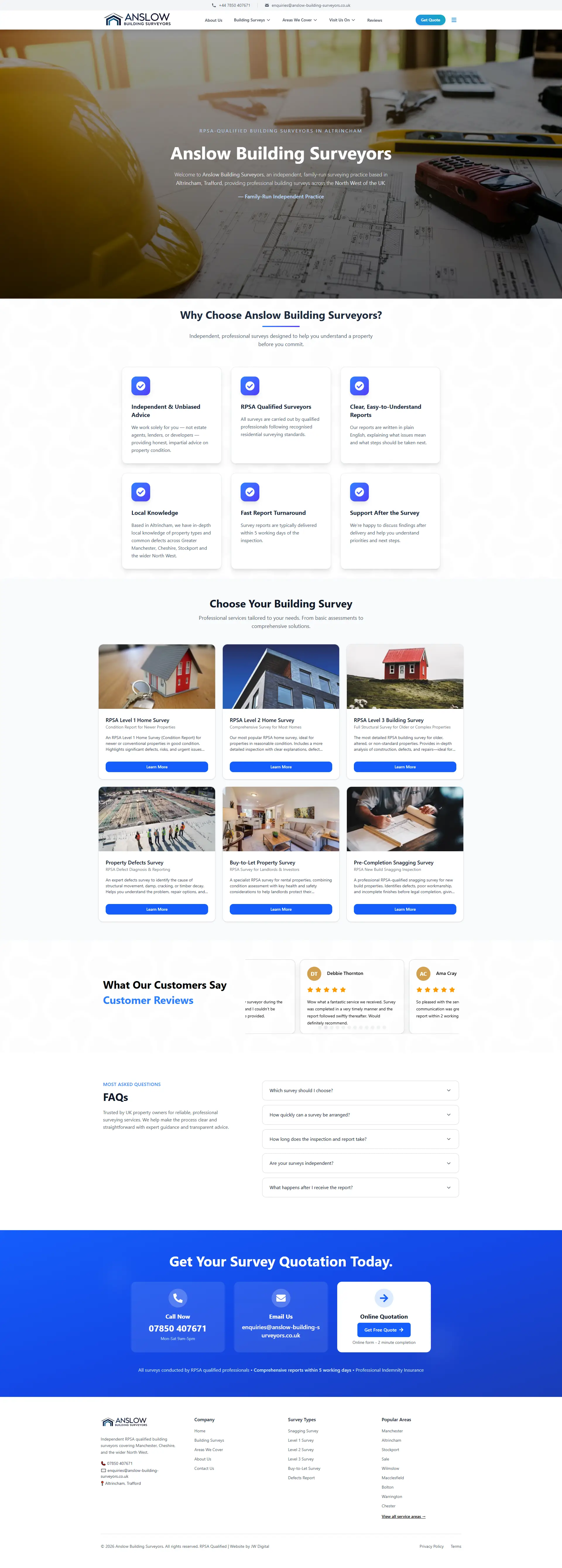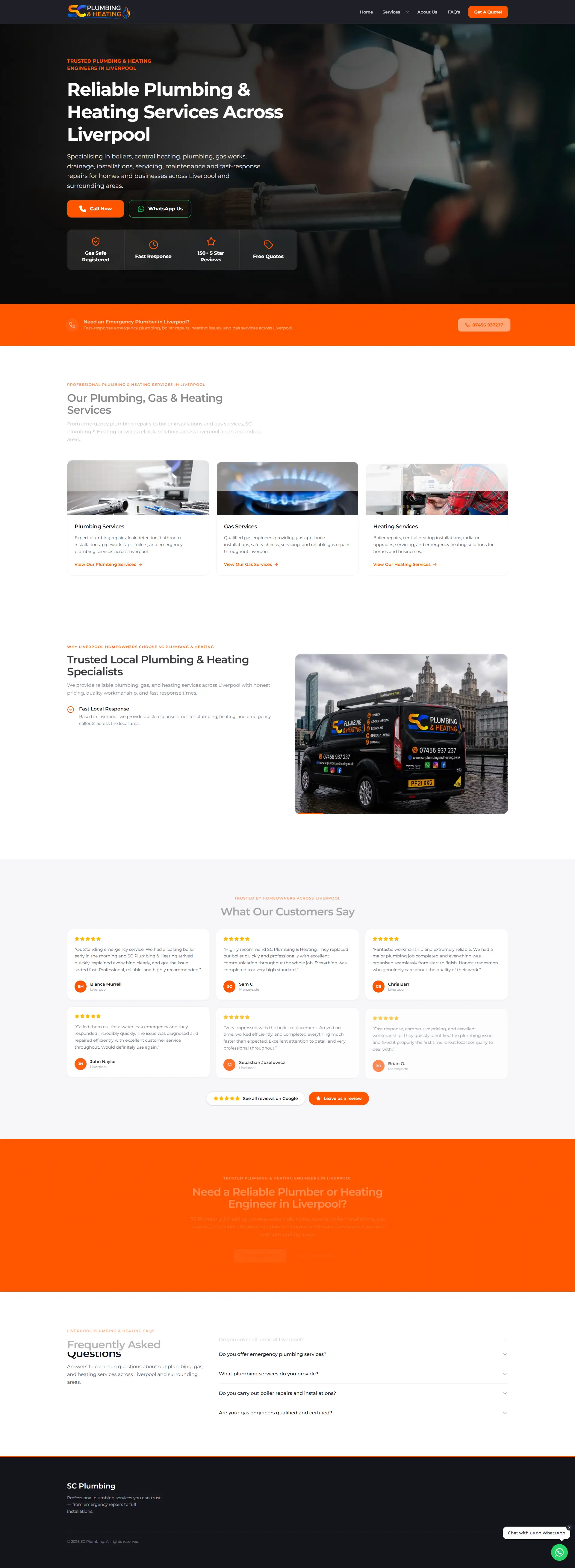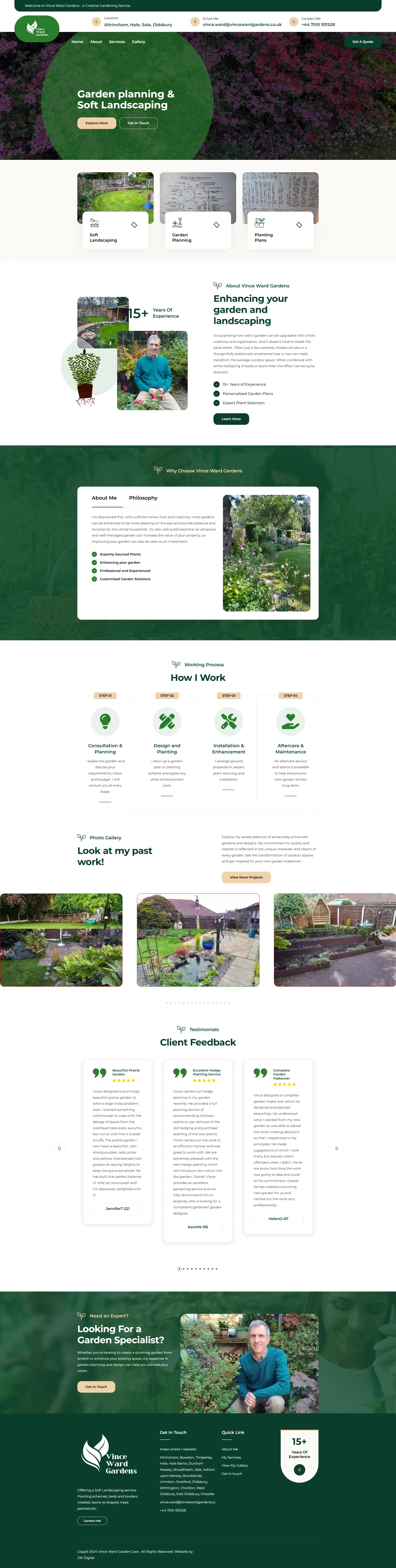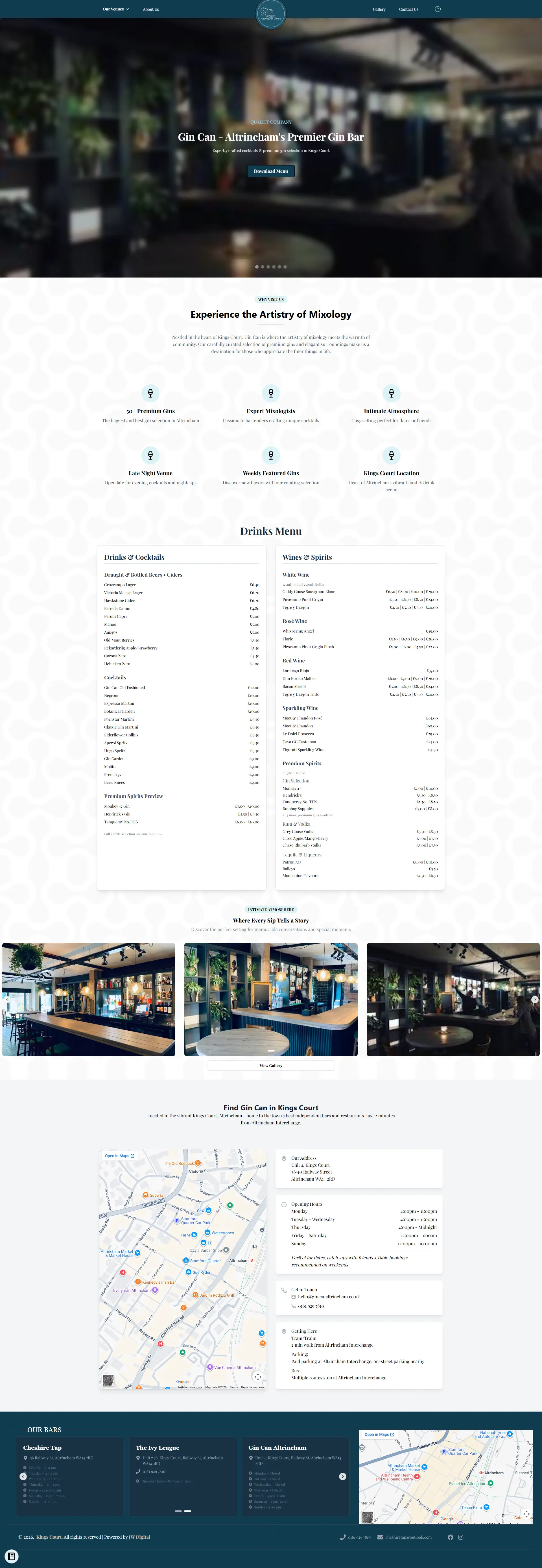

Legibility, simple navigation and an obvious path to a person — every page
Most benefits and welfare visitors are older — often 60s, 70s, 80s — and are typically less comfortable on smaller phone screens, smaller typography and cluttered layouts. We design websites with high-contrast, generously-sized typography, simple top-level navigation, and a consistently obvious 'talk to a person' path (callback request and a click-to-call phone number) across every key section. The build is mobile-first because that is where most visitors will land, but it is designed for an older mobile audience, not a digital-native one.